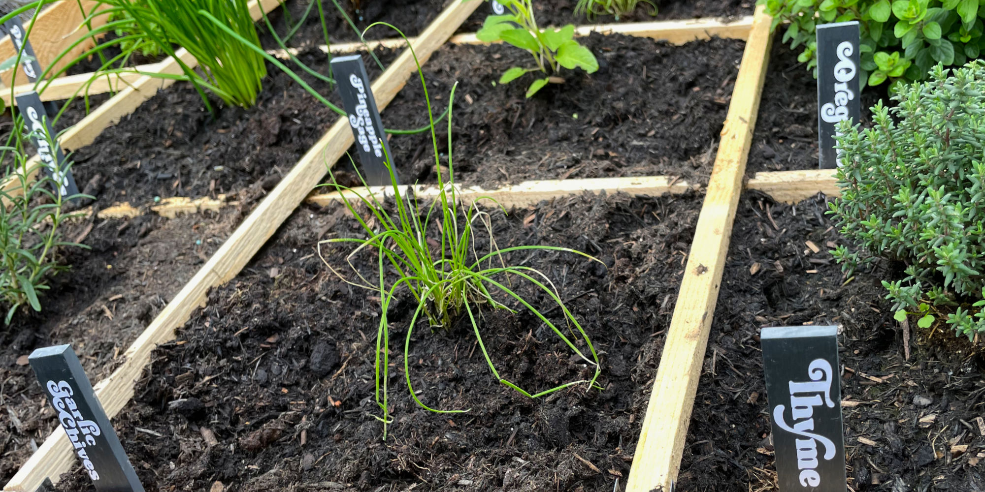
I made a set of slate plant labels to finish the set up of the new herb bed in the garden and to replace the plastic labels that some of them started out with. As spring arrives and we start to spend some more time in the garden I want to bring our recent additions into feeling a definite part of our space and to add decorative but useful touches to the planting areas were are still working on.

We set up the herb bed in February, with space for twelve herbs. I’ve gone with most of my favourites for cooking and other home uses, plus a couple of wildcards. I have selected:
- Parsley
- Sage
- Rosemary
- Thyme
- Dill
- Chives
- Oregano
- Garlic Chives
- Curry Plant
- Pineapple Sage
- Hot & Spicy Oregano
- Tuscan Blue Rosemary
I chose to use slate plant labels as they are made from a natural material and extremely hardwearing, and I am hoping that they will last a lifetime. I made an initial set of labels in my first year of gardening, to ensure that the lettering that I used would not come off. I used a permanent, waterproof vinyl that has not been affected one bit by snow, wind, rain, mud, or anything else, yet I know that if I ever wanted to change the lettering I could weed the vinyl off and add new text (in fact, I did this with the labels from my first season growing as I decided to go for a less sensible and far more fun font choice).

The labels I made today are a smaller version of the larger 20 x 3cm slate plant labels that I use in the vegetable beds and at the bases of my fruit trees. The ones I have worked on today are 15 x 2cm, and better suited to the scale of the new herb bed as it contains 12 smaller sections within it, each requiring a label.

I have used the same typeface as for the larger labels, to help tie all of the garden elements together visually, and because it makes me smile every time I see them. Initially the typeface I chose was a beautiful classic font, and would have fit seamlessly into a National Trust garden, but these curly-wurly labels are joyous, and I’m so glad that I went with the joyous choice.


